Pantone is a company known around the world for their attention to detail when it comes to color, but boy have they really missed the mark this time. Every year the company selects and announces a ‘Color of the Year’ and while we like where Pantone’s heart is at, they failed so hard with 2018’s ‘Living Coral’ color campaign, in so many ways.
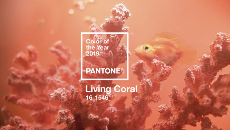
Let’s just start with the obvious – the image used to illustrate the ‘Living Coral’ color on Pantone website is an artificial coral so it’s neither real and definitely not alive. Secondly, the fish swimming around with it is a blood parrot cichlid, a man made hybrid fish that is artificially made and often also artificially dyed, so pretty much the least natural fish in existence – it’s also a freshwater fish which would never be swimming with corals.

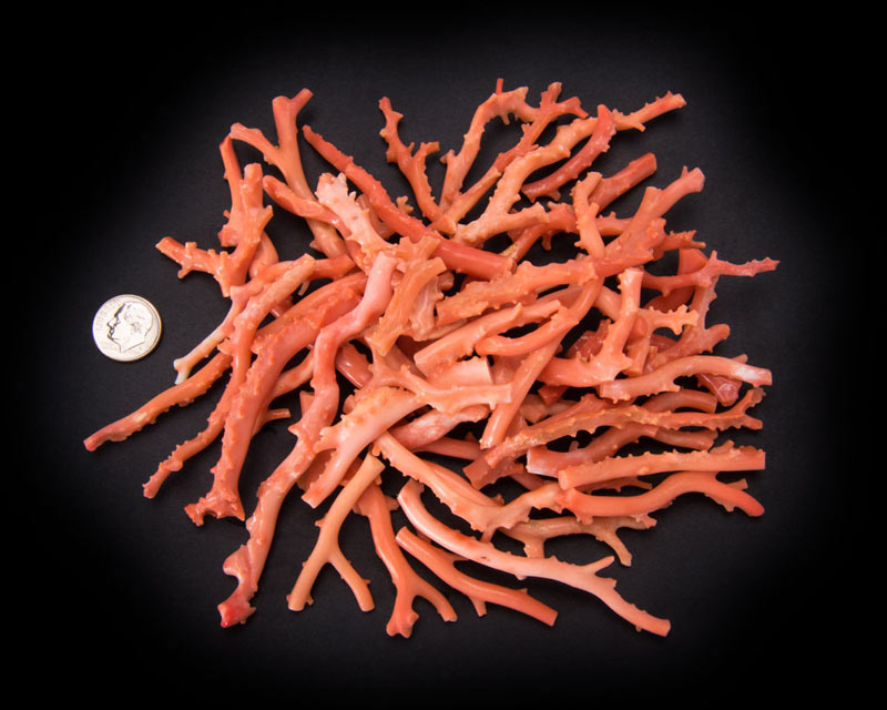
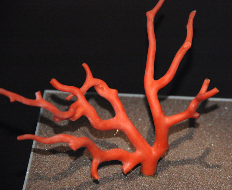
These first missteps are easy enough to attribute to an art department that really doesn’t know any better, but the final point is a really egregious one. The rosy pink, orange-red color that we call ‘coral’, and which Pantone is calling ‘Living Coral’ is actually the color of the skeleton of precious coral, Corallium rubrum.

We get that Pantone is trying to bring attention to the plight of corals and bleaching but using the color of a coral skeleton to represent ‘Living Coral’ is so tone deaf it’s sad. Not for Pantone but for corals in general because it’s like no one at that company has any real idea what a coral actually is.
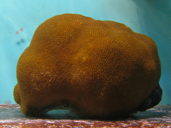
The color of 99% of living coral is a rich, unapologetic brown – not exactly a catchy hue for a company trying to promote the appreciation of ‘color’. Between the use of a fake coral & a mutant freshwater fish for its marketing, and naming a color ‘Living Coral’ based on the color of a coral skeleton, we’re not sure how Pantone could have fumbled the idea of living coral any harder, or what they can do to fix it. [Pantone]


