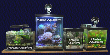
After looking at the same Wet Web Media homepage for over 25 years, it was with great shock that we saw WWM has changed their homepage. Not only is it different but it is better. The image above shows some a creative navigation scheme which quickly directs you to the relevant sections of the website (which is still like looking at a train wreck in suspended animation). However we are uncertain why freshwater topics get three sections and marine aquariums only get one. I guess this part of the navigation is still clinging to old ways. Say what you will about the facelifted site, if you can find it the site still contains the most complete repository of wide ranging aquarium topics.
Wet Web Media homepage gets overhauled, the devil reaches for a sweater

Jake Adams
Jake Adams has been an avid marine aquarist since the mid 90s and has worked in the retail side of the marine aquarium trade for more than ten years. He has a bachelor’s degree in Marine Science and has been the managing editor of ReefBuilders.com since 2008. Jake is interested in every facet of the marine aquarium hobby from the concepts to the technology, rare fish to exotic corals, and his interests are well documented through a very prolific career of speaking to reef clubs and marine aquarium events, and writing articles for aquarium publications across the globe. His primary interest is in corals which Jake pursues in the aquarium hobby as well as diving the coral reefs of the world.
Share This
Previous Article


