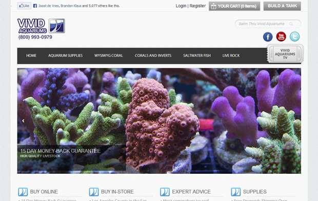
There are some pretty tech savvy people in this hobby, but often our online experience with stores and vendors seems to take us back to the 90s or early-2000s. When we see websites doing a great job like the Vivid Aquarium website refresh, we like to point it out.
Not only did Vivid do a complete refresh of the user experience, they listened to its customers on what information they needed when looking for new equipment or livestock. They also took advantage of modern tools to educate consumers and bring useful information to the forefront.
Vivid put together a top-10 list of how they improved the site. We figured we can just go down the list and add our input along the way.
1. New contemporary design with bigger, better pictures and all new livestock descriptions.
First off, you get a nice clean interface with quick response. Even a matter of a few tenths of a second can make a difference between a purchase and a lost sale and the new Vivid website is quick and smooth. The livestock descriptions are written well and include lighting and placement requirements for coral and food and compatibility issues with fish.
Reef Builders Grade: A
2. Vivid Aquariums TV
Vivid added plenty of video along the way. Video is a great way to share complex information in an easily consumable and understood format. The videos are hosted on YouTube making it easy for you to share video on forums, in email, share on social networks and view on mobile devices. The topics covered are important, however the production could a bit smoother and more natural. We expect these to get better over time. Tip for the team — use more simple graphics along with the narrative.
Reef Builders Grade: B-
3. Build a Tank
Vivid added a wishlist feature with its Build A Tank feature. Separates you equipment by category so you can map out your ideal tank and use to build your custom tank. We like this feature but would love to see it expanded to include a stocking wishlist and a gift registry function.
Reef Builders Grade: B
4. Updated Filtration Diagram
This is one page dedicated to illustrating and explaining a filtration system on a reef tank. Pretty straightforward and useful for beginners, but not a huge need overall so we didn’t give it a high grade since it is useful to a small portion of the audience.
Reef Builders Grade: C
5. Improved Aquarium Supplies Section
The aquariums supply section is clean and straightforward using both text and images to categorize products. We found the navigation pretty quick and easy. Breadcrumbs on the top show you exactly where you are for easy navigation. There is also plenty of video in this section, but we would like to see more graphics or products.
Reef Builders Grade: B-
6. Budget Friendly Pages
Vivid is offering free livestock shipping for purchases over $225 along with coral selections under $35 and fish under $30. We appreciate the budget-friendly nature of the website but would also like to see some higher quality “door buster” corals from time-to-time to give people an incentive to return more often.
Reef Builders Grade: B
7. View Livestock By Region
This is one of our favorite features of the site. Click on a region of the map to choose livestock from that area. We often mix and match coral and fish from all over the globe, mixing livestock that never come close to each other in nature. This is a great way to build a geographic biotope for a unique aquarium.
Reef Builders Grade: A+
8. Vivid Grown Coral
Aquacultured coral is a great way to ease our burden on the ocean’s reefs and is a staple of most online coral slingers. Good to see these corals separated but we’d love to see this section grow over time.
Reef Builders Grade: B-
9. Updated Forum
The refresh includes a forum overhaul. We are always fans of user forums as a great way to engage customers and empower your super customers to advocate for you whenever possible.
Reef Builders Grade: B
10. Featured Products
Want to know what these guys use at the shop? The featured products section showcases the products Vivid uses at it facility. Included videos and descriptions.
Reef Builders Grade: B+
Overall we really dig the website and think it will only improve over time. As customers are getting more savvy, your virtual storefront needs to be as appealing and useful as the products you sell. We would hope more vendors would look at refreshing their websites as well. What do you think of the new website?


